Case study 03 · Concept feature · Working prototype
Four ads, no skip. Now you know when your show is back.
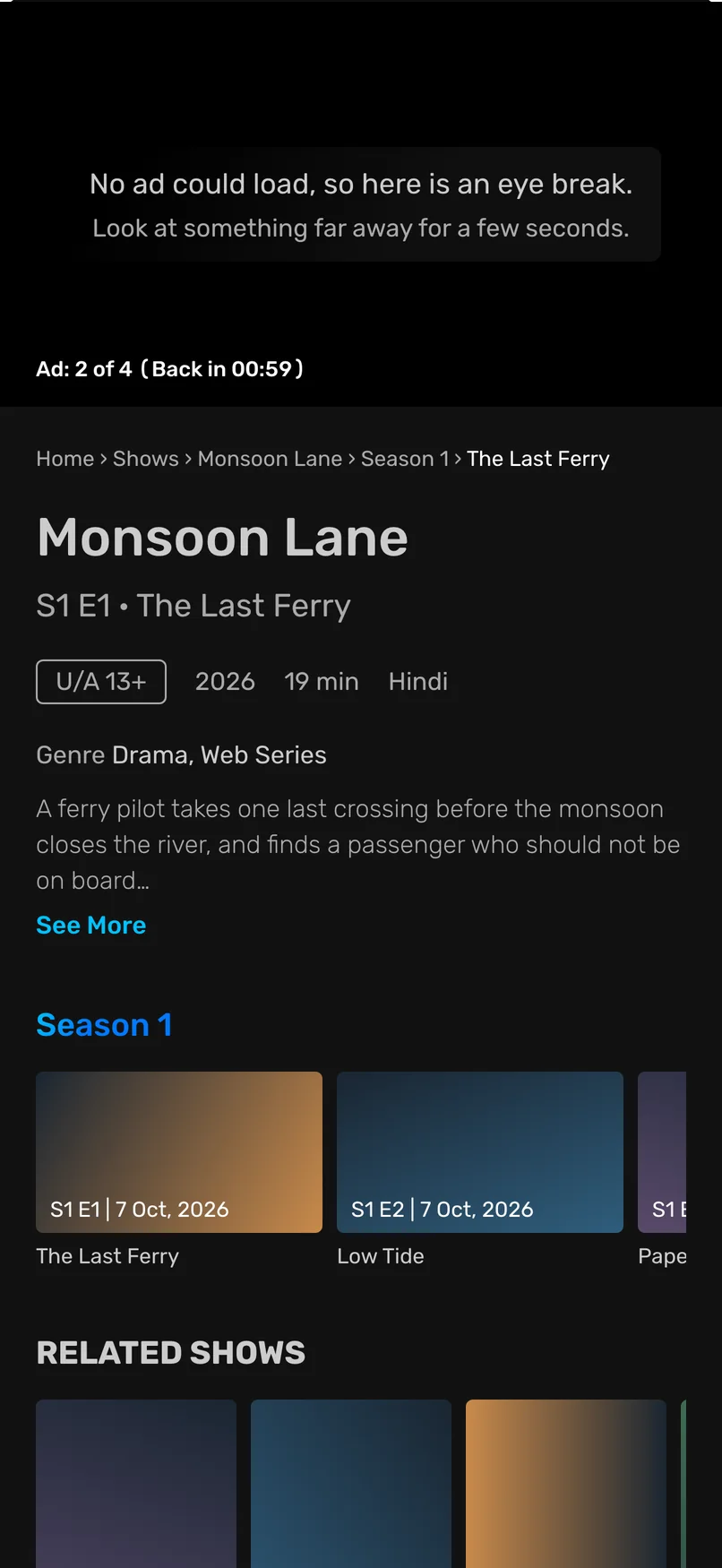
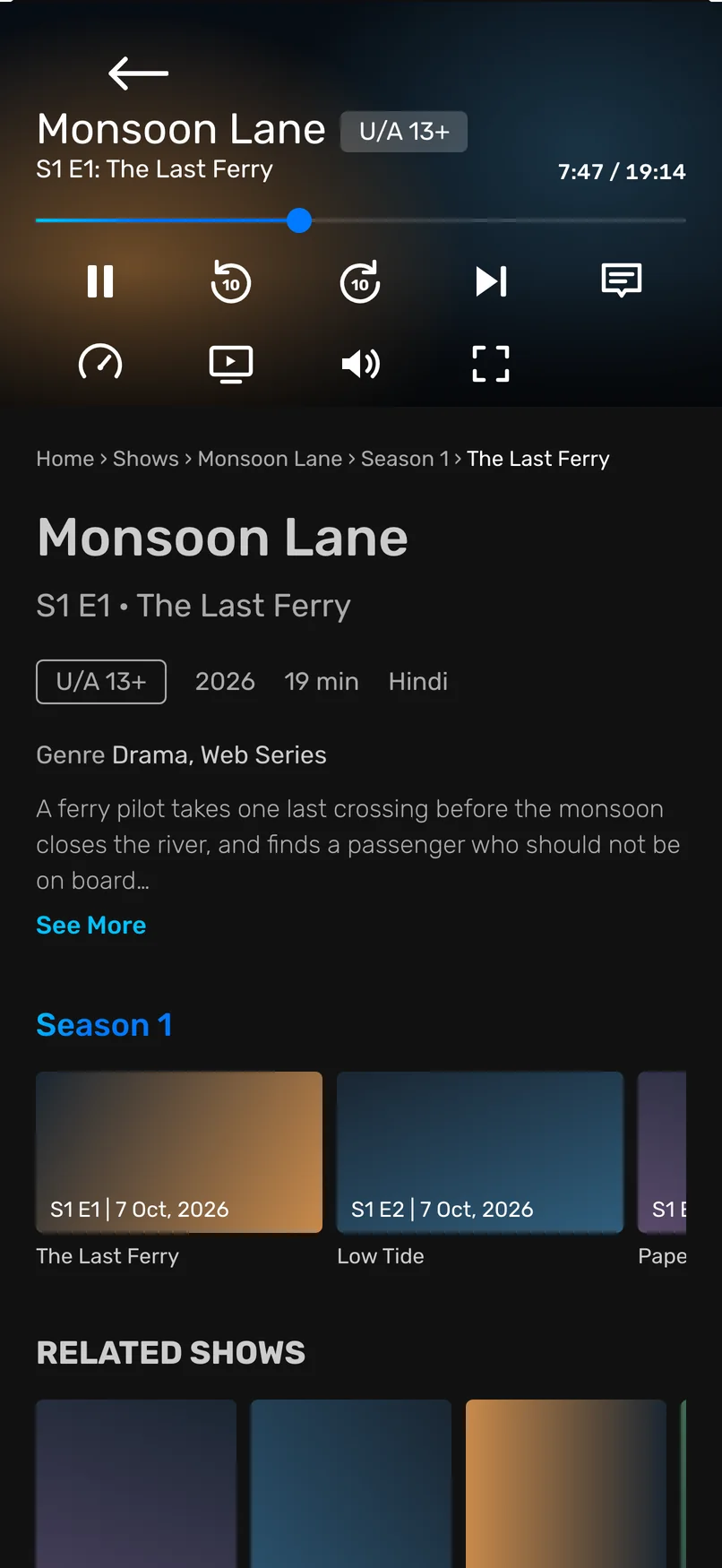
The working prototype. It plays by itself. Switch to Today to compare, or make an ad fail.
Role
Product designer
Product
Amazon MX Player
Platform studied
iPhone app
Context
Self-directed concept, 2026
Tools
Claude Code, React, FigJam
Research
246 reviews, and my own time in the app
Testing
Not tested with users yet
A concept project, not made or approved by Amazon or MX Player. The show, the ads and
the brands on these screens are made up.
Why I Chose This Product
MX Player is free, so it runs on ads. Ads are also the top complaint in its reviews. On iPhone there is no way to pay them away. So the ad break is where design can help.
Problem Identification (what's broken and why)
I watched an episode. Four ads played back to back, with no skip. The timer counted one ad at a time, so I never knew when my show would be back.
The break today. A warning, then a timer for one ad.
Reviews add two more problems. An ad that never loads locks you out. And the same ad plays again and again.
Research & Competitive Benchmarking
I read 246 low-star reviews, used the app, and looked at how YouTube, Hulu and Netflix handle ad breaks.
01 · Too many ads
The top complaint in reviews, on iPhone and on Android.
02 · Ads that freeze or repeat
An ad never loads and locks you out. Or the same ad comes back.
03 · No sign of the end
From my own viewing. The timer covers one ad, not the break.
The opening
I can't change that viewers see ads. I can change how clear the wait is.
My first idea was wrong. A stuck ad looked like the main problem, but Android reviews barely mention it.
Design Goals & Constraints
Keep every ad. Make the wait clear and safe.
The goal is not fewer ads. Ads pay for the app. The goal is a wait you can see the end of.
For the viewer
Less guessing. Less frustration. A break with a clear end.
For the business
The same number of ads. Every slot still filled. Fewer viewers leaving.
No new visual parts. The timer and the text are the player's own.
What works stays: the warning, the ad count, the Learn more button.
Key Design Changes & Rationale
What I changed
What it should move
Why
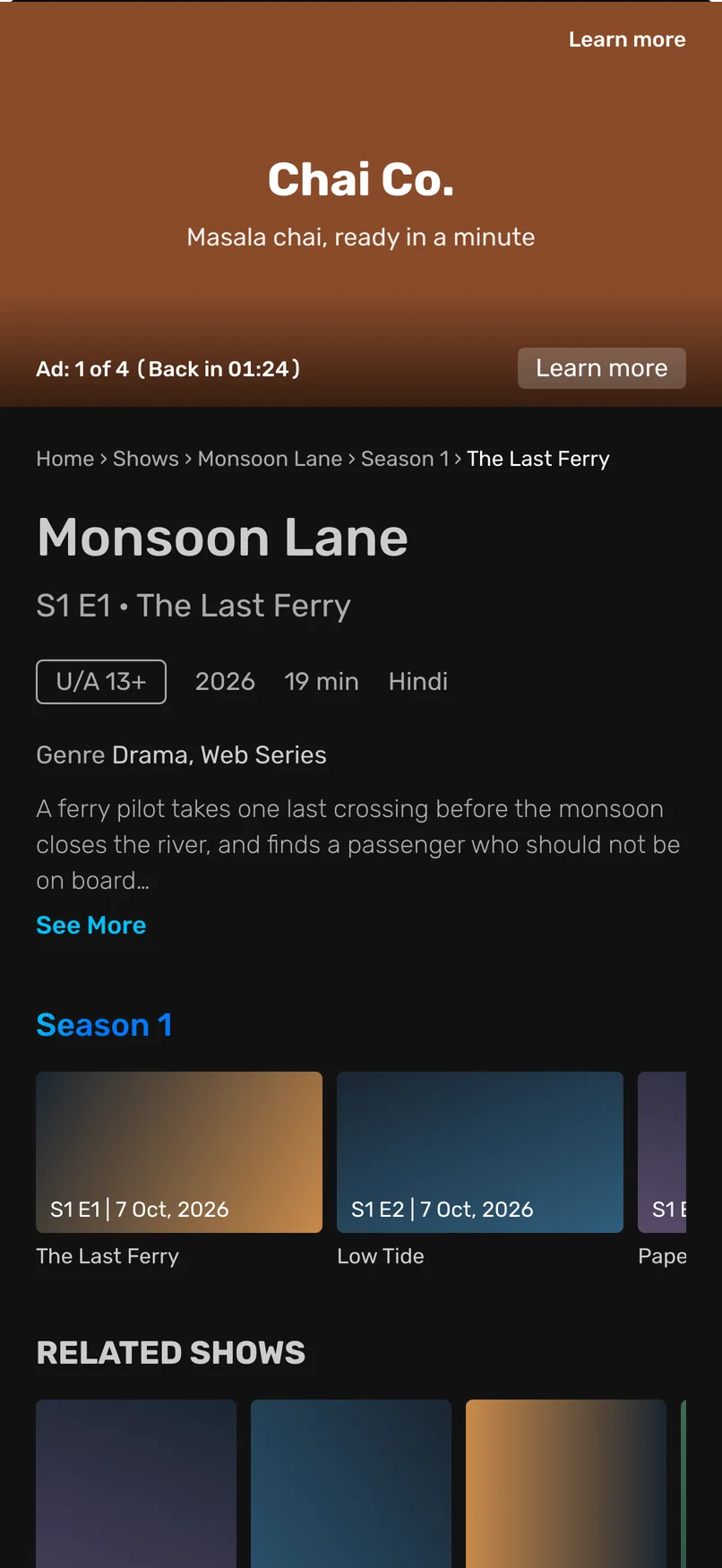
The timer shows the whole break: "Back in 01:24"
More viewers stay through the break
You can wait for an end you can see
A failed ad is swapped for another
Fewer breaks end on a stuck screen, and more ad slots play an ad
The break keeps moving, and the slot still earns
No ad plays twice in one break
Fewer viewers leave out of annoyance
Repeats are a top complaint. This is my weakest link
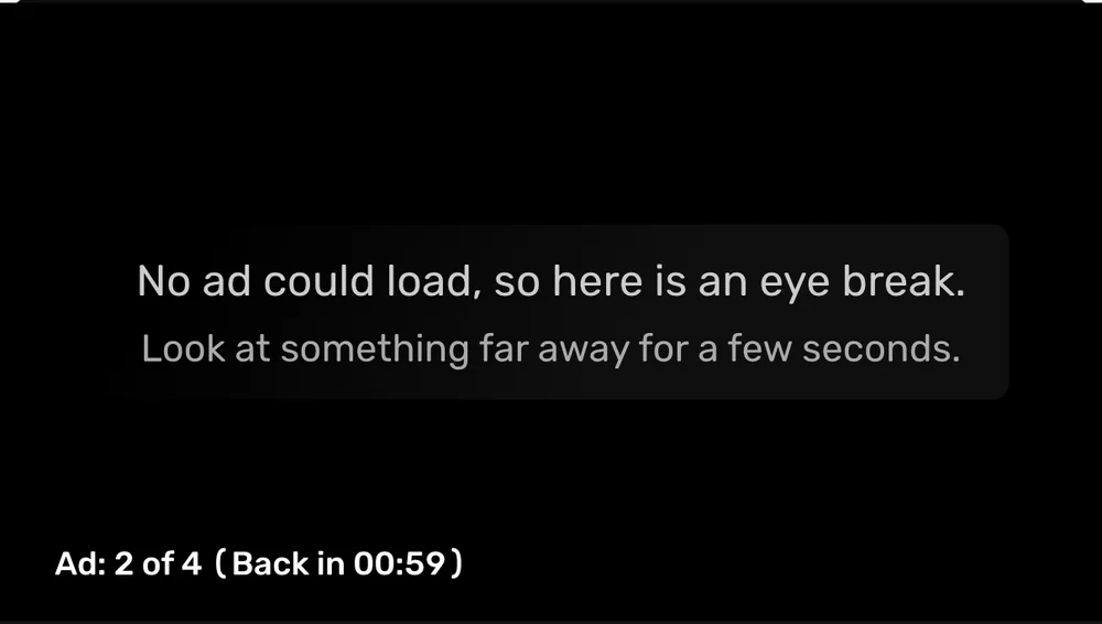
An idea I'm exploring: if no ad can load at all, a short eye break replaces the black screen. I would test it first.
Ideas I dropped
Why
Fix only the stuck ad
Android reviews barely mention it
A progress bar for the break
The app has no such bar, and I add no new parts
Split the break into two shorter ones
A YouTube survey found viewers prefer ads grouped
Let the viewer choose when ads play
One more step, and ads may be sold by position
Point to an ad-free plan
None exists on iPhone
An eye exercise over a playing ad
It takes attention the advertiser paid for
Before vs. After
Left is today. Right is the concept.
Same ad, same place. Only the timer changes.When no ad loads. Stuck today. The concept tries another ad first. This eye break is the fallback I'm exploring.
What I'd Validate If This Were Real
The north star: episodes watched to the end, per viewer, each week. A finished episode means the viewer got their show, and MX Player showed its ads.
What feeds it:
The share of ad breaks a viewer stays through.
The share of ad slots that play an ad.
What must not get worse: ads shown per session.
Limitations & Honest Caveats
Four ads in a row still feels bad. Design can't fix the number of ads.
The MX Player team has likely thought of this, and knows things I can't see.
Nobody has tested it. I was the only viewer.
I used the iPhone app only. Most users are on Android.
Reflections
Most of the work was taking things away. I designed a counter, then learned the app already has one. I designed a progress bar, then learned the app has none. What stayed is small, and it fits the product.
Usability Testing (Not Done Yet)
Next, I'll show five MX Player viewers both versions and ask one thing: when do you think your show comes back? If the new timer doesn't help them answer, the first change is wrong.
Final Prototype & Key Screens
The working prototype is at the top of this page. You can also open it on its own. These are its key screens.
The whole break, counted.
No ad loads. The fallback I'm exploring.
Back to the show.
Outcomes & Reflection
3changes to the break
0ads removed
0new visual parts
4times I changed my mind
Nothing shipped, so there is no result to claim. What I have is a small, careful change to a moment most viewers dislike, and a clear way to test it.